e-commerce

• To design their website & they require the home page to be impactful & interactive
• Bespoke Quiz flow where users could take a quiz with recommended chocolates as the results
• User-friendly interface

Proposed a warm colour palette with hints of pink. Suggested serif fonts for titles as it evokes professionalism & sophistication and san-serif body fonts for easy readability.
Concept images including the contrasts and colours to be similar to the warm colour palette making the overall website look and feel to be consistent.


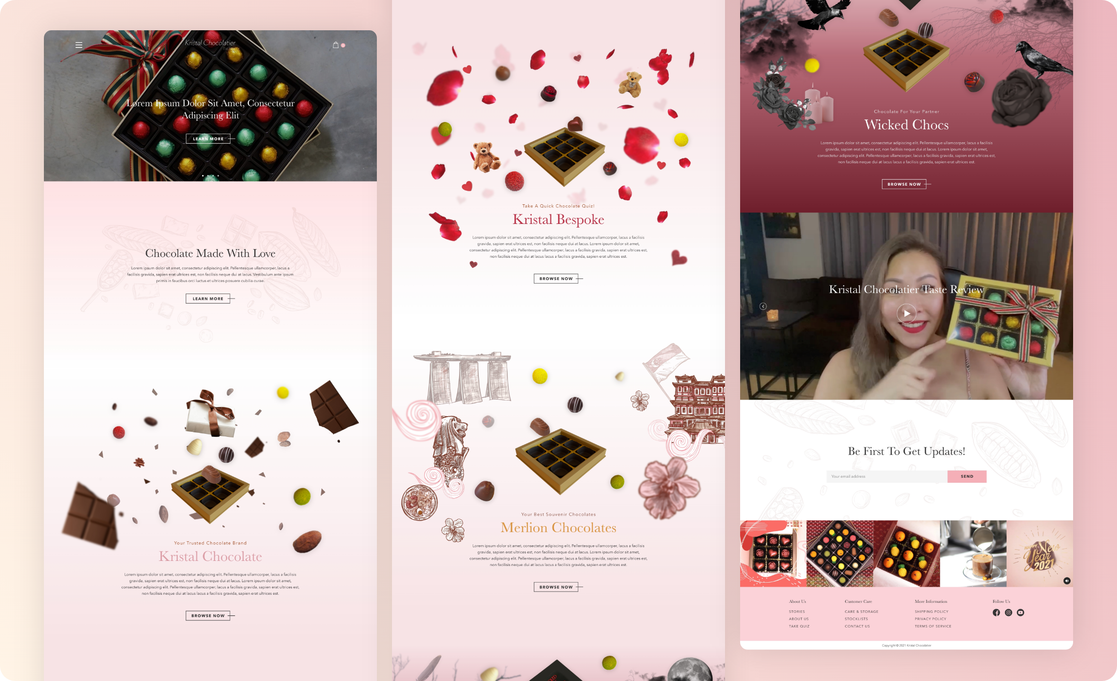
I proposed parallax animation for each brand sections with specific graphics tagged to it. The overall concept was to make it feel like the chocolates are falling into the gift boxes for each section.
Kristal Chocolate brand I used chocolate chunks and cocoa beans. Kristal Bespoke brand I used rose petals and soft toy bear for a Valentine's theme. Merlion Chocolate brand I used Singapore's heritage & cuisines graphics. Lastly, Wicked Chocs brand I proposed a darker theme with moons & crows graphics.One of the main task for this project was to design an impactful and interactive home page to entice customers to browse throughout the website.
I proposed a structure that is catered to both the showcasing the parallax animation and user experience of the website. The section "Chocolate Made With Love" comes after the hero banner as it shows a short description of what the Company specialised in. Showcasing of the 4 major brands section with parallax animation comes next, this further attracts customer's attention.
Reviews are often very important on the e-commerce website as it shows how trustworthy the brand is. Therefore, a video review sections is structured right after the 4 brands sections. Follow by a subscription section to prompt customers to sign up and get instant updates. Lastly, showcasing their instagram feed for customers to explore more about the brand.
Straightforward user-friendly navigation that is intuitive for the users.

Following Kristal Bespoke valentine's theme, the landing page of the quiz is filled with rose petal graphics at the background. There will be a quiz progression bar at the bottom when customers are doing the quiz. Quiz answers includes text, images with text, single section and multiple selections, this gives the flexibility and scalability for the client to create their own customised quiz.
Multiple products results will be shown according to what the quiz answers customers picked. From there, customers are able to add those recommended chocolates to cart and proceed to checkout.


I spend lots of time, blood, sweat and tears finding suitable graphics for those sections on the home page. I had to individually clean up the graphics, placed it strategically on the designs so it does not look too overly crowded. I had to work close with the dev team, to export the right layered assets for them to programme the parallax animation effect. It turn out super well in the end and the client were happy with the website too!